
Design Systems & Frameworks
Information Architecture, Holistic Design, UX Frameworks
It started with the Current Environment
In 2013, Statefarm commissioned an external vendor to design a solution for both visual and information architecture components. During the time of it's release, it was very successful. But over the years, this solution has become out-dated and Statefarm has fallen behind competitives in the digital space.
Due to the redesign effort for Statefarm web domain I was assigned to this project as the leading information architect. And this is my perspective and design strategy on what my team and I proposed.

Topology: What a Mess?
Overview
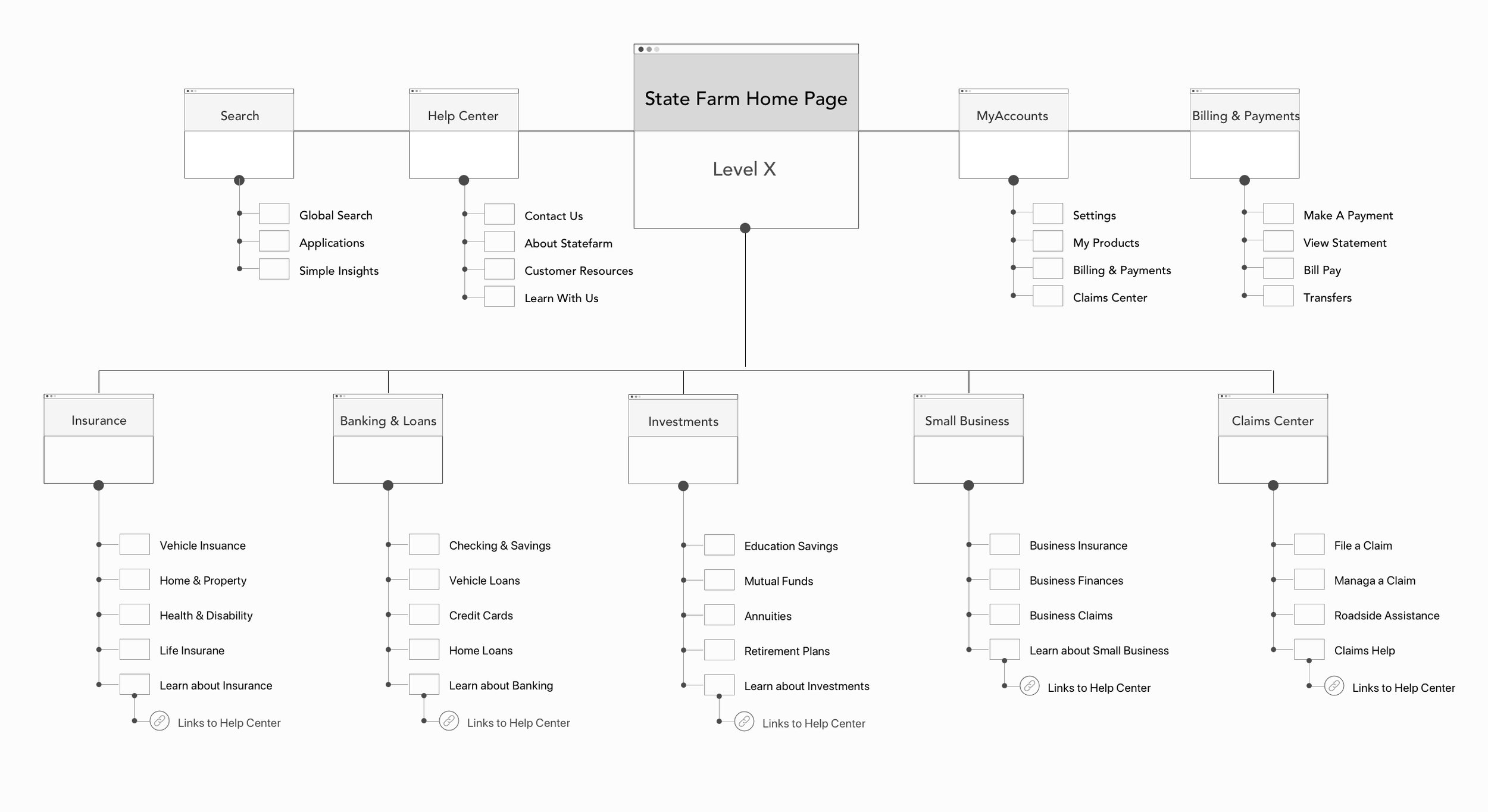
Due to the lack of consistent experiences within the current environment, we want to restructure the State Farm web domain as a Self Services Ecosystem to help create interdependent relationships for our customers. Our goal is to stop looking at individuals or single applications, but rather the global services & architecture we provide to our customers and create a seamless experience with consistent components and behaviors.
Current State vs Future State
Structuring the Product Towers
Ontology: It’s time to organize the content and navigation
Before & After
Left - Old Design | Right - New Design Templates
The Process
We conducted workshop with Product Owners, UX Designers, Researchers, Analytics & SEO team to complete an analysis of the current state. We compiled the findings into a SWOT analysis document & compared it to the future proposed architecture. We ended up with a solid understanding of customer feedback, and SEO suggestions to help improve the overall experience. During our workshop we enhanced the following: 1. Global Navigation, 2. Content Audit, 3. Asia Templated System (ATS), 4. ASIA Ecosystem Customer Journey & 5. Self Service Ecosystem.

Ideation - Wireframing
A Visual Tour
Global IA Sitemap & Taxonomical structure
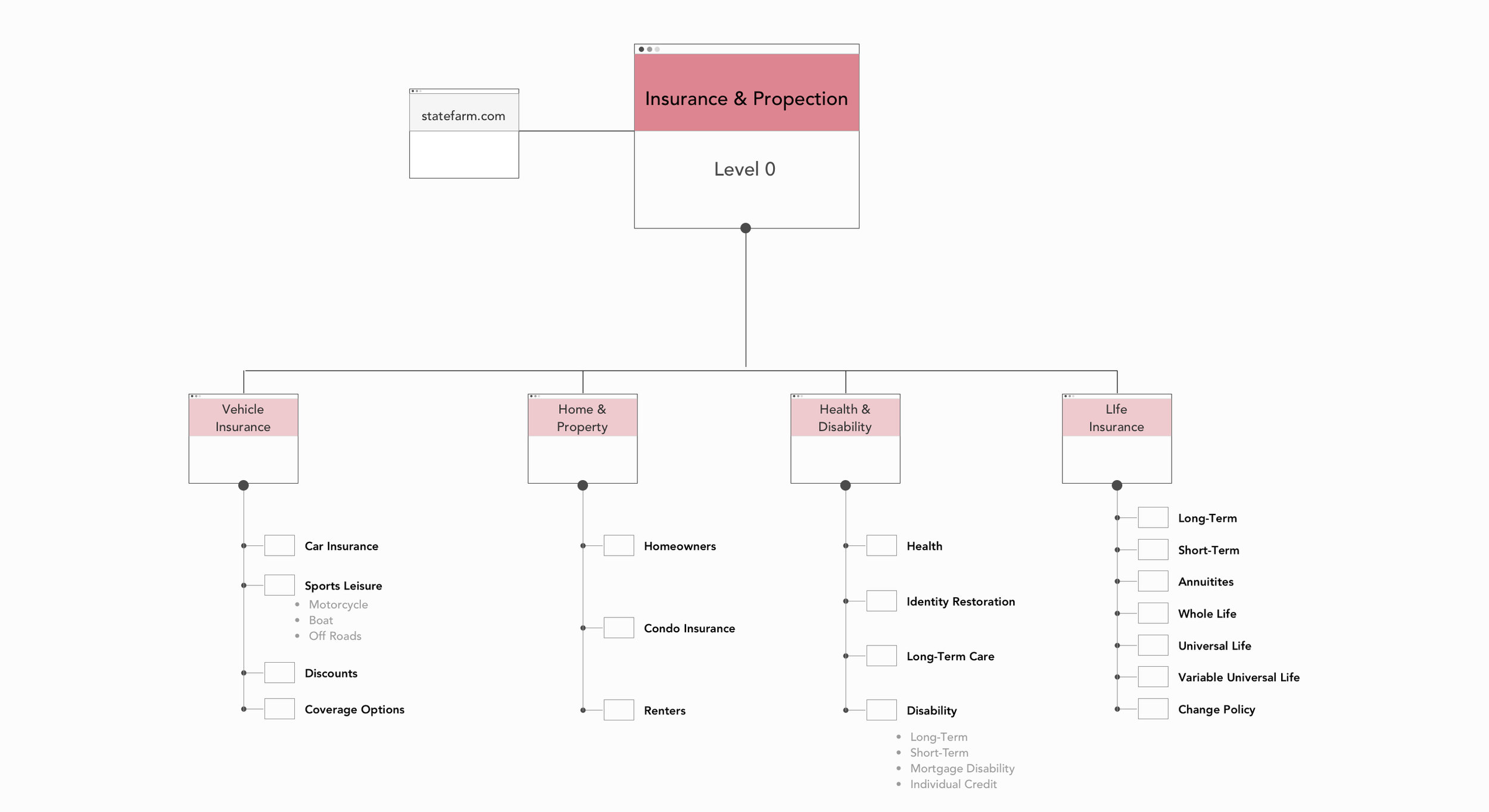
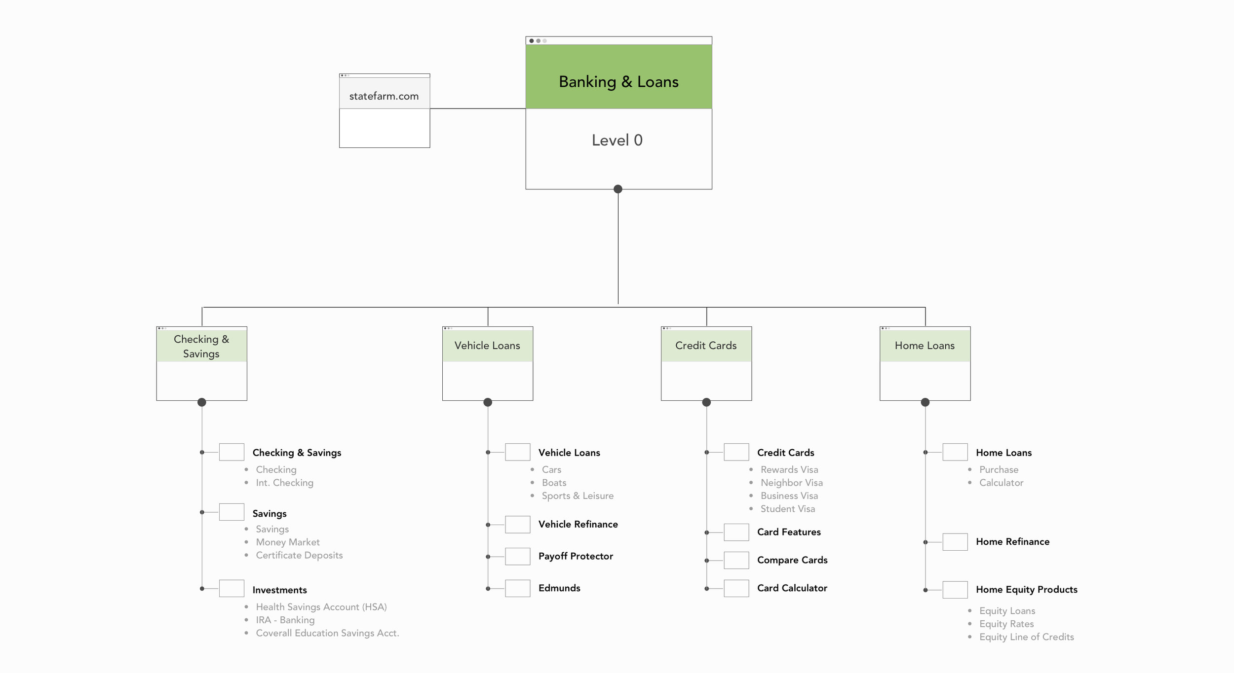
Architecture & Taxonomy
The primary problems with the current website involve organization schemes, taxonomical labeling, navigation and searching. The following strategies and recommendation are aimed at providing solutions to the State Farm Web Domain.
Recommendations:
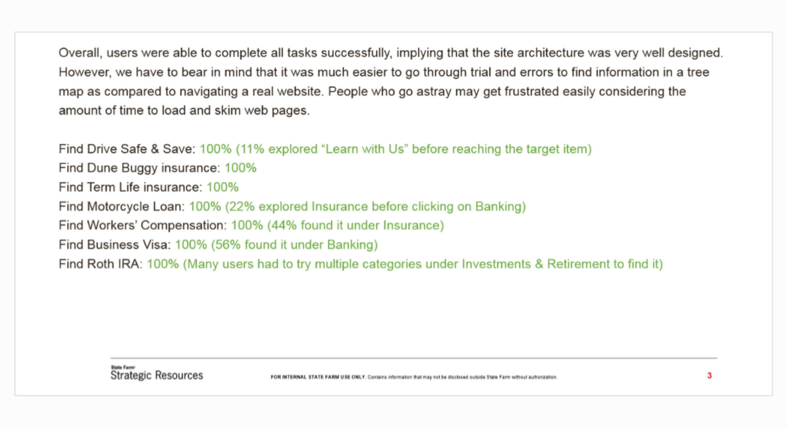
- After the Tree Testing, for a few customers, it took some thinking process for them to find loans under banking. So, we suggest changing Banking to “Banking & Loans.
- Consider moving the discount programs under vehicle insurance to make it more easily accessible. If it only applies to cars, clearly label it “car insurance discounts.
NAvigation structure
Unauthenticated Navigation


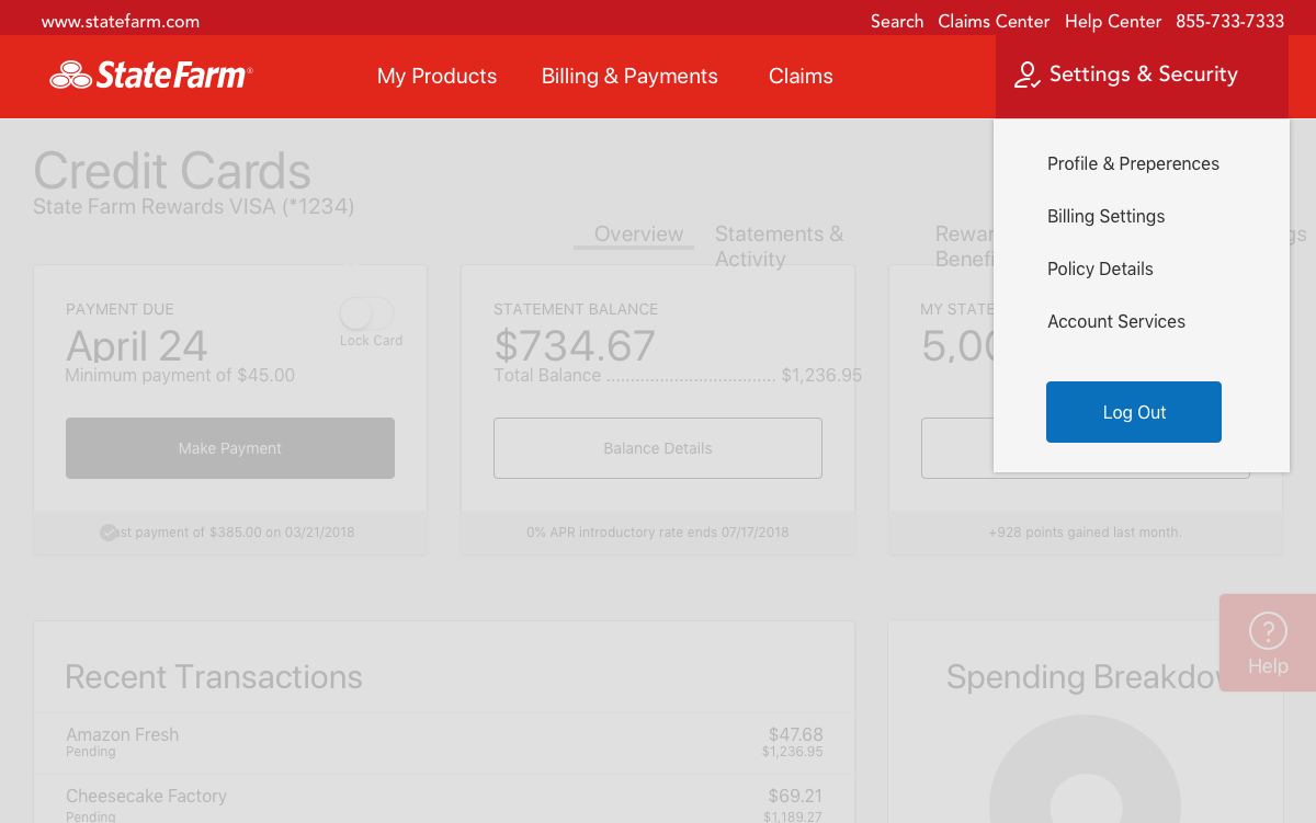
Authenticated Navigation
Navigation Redesign
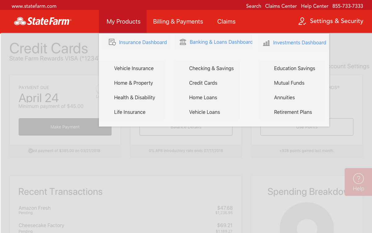
Navigation affects traffic and findability to State Farm products. With the current hamburger menu, research states we need to redesign a navigational system to expose products and services. Incorporating a Mega Menu with rollover to avoid the bad connotation with drop downs is best practice according to usability studies
Recommendations:
- Completely separating Banking from Finances. This will help expose bank as a separate tower and increase its findability to customers.
- Dividing Finances into Banking and Investments, alleviates confusion and provides lucid direction to customers and beneficial to SEO.
- Expose products in the top navigation and get away from the hamburger menu.
- Incorporate a second level navigation for local pages.
- Utilizing breadcrumbs for the hierarchal arranged pages.
ASIA Templated System
ATS Engagement Model
The ASIA Template System was created to highlight the importance of a consistent experience within the State Farm .COM domain.
The template system will provide several page-types, namely, Acquisition, Servicing, Informational and Advertising. And within each page type we are focusing on the content structure and consistent elements from the global architecture ecosystem.